Vancouver and Vancouver Island
Vancouver on the west coast of Canada has the flavour
of a city at
peace with itself. Pleasant to walk around and posessing a microclimate
which seems to give it a warm, temperate feel at most times of the
year. Modern, yes, but not brutal in its develoment. A once notorious
part of town, the area including Chinatown, which includes the
largest classical Chinese garden outside China, still bears wall
lettering from an era when traders proclaimed their names and wares in
paint high on the sides of buildings to catch the eye of pedestrians
from afar. Below, two 'Army & Navy' signs for the price of one:
'DODSON HOTEL
ARMY & NAVY
DEPT. STORES LTD
COMPARE OUR PRICES'
(The last in orange condensed capitals.)
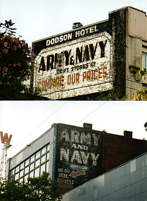
Further down the street, perhaps an earlier site of
this store:
'ARMY AND NAVY
DEPT. STORE
WE DO SELL XXX FOR LESS'
plus a diagonal arrow. We wonder what lettering the
brick red paint is
obscuring to the left and below the word 'less'.
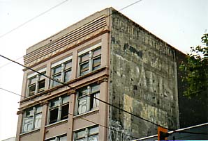
Not far away...
'HOTEL STRATHCONA
HOME OF
P.PARIS
SHOES FOR ALL THE FAMILY'
Followed by a silhouette illustration of a seated
customer have shoes
fitted by a kneeling assistant; then a bit of modern spray-can grafitti
over the lower left of the picture. This is a less clear example than
those above, but shows signs of an earlier generation of lettering.
'Hotel Strathcona' in larger capitals seems to have once sat on the
line of the words 'home of'.
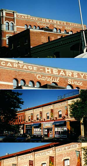
Then we move across the water to Vancouver Island with its major city,
Victoria. The clue is in the name: indeed this is more British than the
British. No wonder that this huge area of Canada is called British
Columbia. The period buildings are handsome colonial versions of
Victoriana, replete with fine lettering here and there which looks as
if it is not merely tolerated, but actually conserved for the
twenty-first century inhabitants.
'CARTAGE - HEARSY'S - STORAGE
"Careful Since 1890" '
Wonderful. In the photograph and close-up below this:
'Flour & Feed - SCOTT PEDEN - Hay
& Grain'
and on the cornice of the entry at lower right the word
'Market ...'
which looks contemporaneous. Perhaps some Victorians (natives of
Victoria) will get in touch (link at foot of page) to let us know
the rest of the sign.
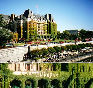
As if to emphasize the homage to the Empress Of India
that is (or was)
Victoria, we find this massive hotel on the waterfront:
'THE
EMPRESS'
with its superscript 'The' followed by 'Empress' in
large and small
caps; the 'R' having a kern which travels under the following 'E'. The
whole effect is rather quirky and unbalanced, but I dare say the sign
is original as is the Virginia creeper which clothes much of the
frontage.
Incidentally, the whole (very large) Vancouver Island
is full of an
interesting blend of colonial names of species (particularly Scottish
ones such as the Douglas Fir) and landmarks (Campbell River) and native
American names and artefacts.
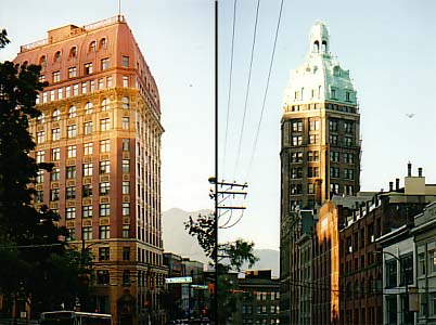
Quickly back to Vancouver city for a glance at
surviving architecture
redolent of the paintings of Edward Hopper (photographed appropriately
in low evening sunlight). No lettering here, but we couldn't resist.
The impressive tower on the right was the home of the city's newspaper.
Gotham City or Metropolis?
And on the waterside behind the Sandman Hotel and a
large entertainment
venue, what could be nicer than a fine geodesic dome? Buckminster
Fuller would be proud.
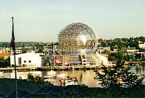
Borin Van Loon has a personal interest in domes and their
construction.