Chester
Bovril & The
Oxo Tower
 Photo
courtesy Rebecca Simpkins
Photo
courtesy Rebecca Simpkins
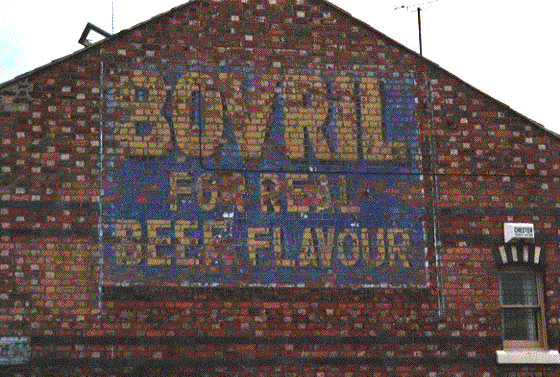
The end wall of this building in Chester is remarkable for its
brickwork
as well as the lettering painted on it. The evidence provided by the
verticle
lines at either side of the advertisement indicate that this painted
version
was covered by a hoarding at a later date (the framework of which was
painted,
thus leaving the marks). This was probably the saving of the Bovril
lettering
and its wonderful blue ground:
'BOVRIL
FOR REAL
BEEF FLAVOUR'
in
yellow/beige
sans-serif capitals with a narrow drop-shadow.
The Bovril company were well-known in the Victorian era from early
advertising
campaigns, lithographic stone posters, press adverts. Who could forget
the
muscular bull strapped to a chair with the slogan 'Bovril By
Electrocution'.
Almost makes a vegetarian feel smug ... Clearly the tradition of the
hard
sell for this rather humble black paste is continued here. There is
even
the bonus of a glimpse at lower left of a painted street name on the
bricks
(now replaced by a metal sign, no doubt).
'BOVRIL' certainly got around big-time. Here's a
fine example used by
permission
from the website run by urban75.com including the brief caption. The
link
to this site is included here.
The blue background still seems to be there (as above) with bold dark
blue
caps on a white panel to proclaim the brand for, presumably, miles
around!
The bands of red brickwork are somewhat puzzling and are presumably the
result of later work on this end-wall.
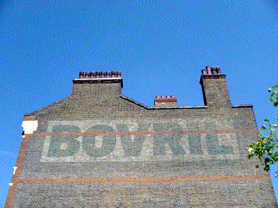
"It probably won't be long before it's painted over, so
I wanted to
capture this glorious old Bovril sign facing Windrush Gardens, Brixton."
[July 2003] photo © Mike Slocombe
www.urban75.com Photo used by
permission.
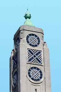
It is not such a leap to move from one famously
branded beef product to another with a similar advertising pedigree.
The humble Oxo cube does not seem that significant, yet its presence in
advertising to the present day makes it ubiquitous. Dating from 1899 it
also has the benefit of being spelt with just three characters, one of
them a repeat (and it includes the word 'ox', of course). This
simplicity was of great significance when the Liebig Extract of Meat
Company demolished most of an old Post Office power station on the
south bank of the Thames and erected a cold store in the 1920s. Liebig
wanted to include a tower with illuminated advertisements for their
products, but were turned down by the authorities. Company architect
Albert Moore built into the top of the tower, on each face, three
vertically spaced windows (circle, 'x', circle) in the deco style
of the period which, coincidentally spelt out a familar brand name.
After a cheqered history resulting in a period when it stood empty and
unloved, local opposition in the 1970s and 80s to total demolition of
the buildings and tower by property developers saved this London
landmark as part of the Coin Street development. The Oxo Tower is now
posh shops, apartments and, at the top, a restaurant (plus, when we
visited, a public viewing gallery - you might need to screen out the
yuppies swigging Bolly while looking at the magnificent vista of the
Thames and London). You can best view the actual 'OXO' lettering from
the river.
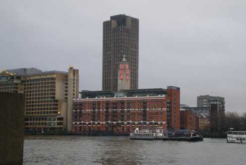
Right: as twilight falls on a wet winter day, the view
of the Oxo Tower from the Victoria Embankment across the Thames, shows
the neon-lit 'OXO' lettering. The tower itself is dwarfed by King's
Reach Tower behind it. More on Waterloo and its environs here.