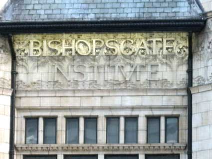
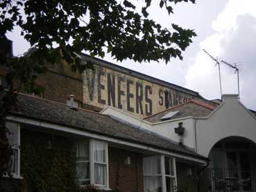
Shoreditch

Here's the original front entrance of the Geffrye Museum in Kingsland Road, the long wings stretching out on either side. In a niche above the doorway stands a fine statue of the great philanthropist with lettering carved below:
'SR ROb GEFFRYES KNT ALDERMAN
AND IRONMONGER
FOUNDER OF THIS HOSPITALL'
Ipswich Historic Lettering: Shoreditch 7 Ipswich Historic Lettering: Shoreditch 8
The museum is set in elegant 18th century almshouses with a contemporary wing surrounded by attractive gardens, which include an award-winning walled herb garden and a series of period gardens behind. And from this garden looking towards the rear elevation of the buildings, a glimpse of a trade sign over the walls and roofs (see the enlargement below it). If these walls could talk...
Ipswich Historic Lettering: Shoreditch 5
How frustrating: if the maple lost its leaves, if the photographer was on stilts, we'd all be able to read the signs and not have to rely on conjecture:
'VENEERS   STAMFORD [TRADING] CO LTD   SHO. 5537
IMPORTERS'
Ipswich Historic Lettering: Shoreditch 6
One imagines a company importing fine walnut, mahogany, fruitwood, then seasoning the timber in its sheltered yards before cutting by hand or by machine the lengths of thin veneer of the finest figuring, to be supplied to cabinet makers and made into the best furniture money could buy.
[UPDATE 31.10.2022:
the 2021 book Ghost signs – a London story (Roberts, S & Roy Reed; see Reading list) has a splendid photograph of this enigmatic sign, seen by passengers from a railway carriage on the Hoxton to Haggerston section of today's London Overground line. This is clearly the intended audience for the sign, which we are now able to clarify and complete, thanks to the book. The Stamford Trading Co. Ltd dealt in veneers here in the 1940s and 1950s and boasted of their excellent quality products – as they would.]

Ipswich Historic Lettering: Shoreditch 1Ipswich Historic Lettering: Shoreditch 2
The Geffrye Museum in Kingsland Road depicts the quintessential style of English middle-class living rooms. Its collections of furniture, textiles, paintings and decorative arts are displayed in a series of period rooms from 1600 to the present day. Next door to the museum, you see is the end wall of the shop at 134 Kingsland Road with its audacious (if somewhat runny) sign:
'BLOOM'S PIANOS
FOR
PERFECTION
... CALL OR WRITE 134 KINGSLAND RD
... BISHOPSGATE 9087

[pointing hand]
NOVELLI SIGNS
       ...     7079
' [see update below]

Perhaps it is appropriate that a museum celebrating the history of domesticity is next door to a purveyor of pianos to the gentry. The enhanced image below reveals some of the clearer lettering below which gives the address and telephone number with the word 'PHONE' just about discernible in front of 'BISHOPSGATE'; however, we wonder if that's a bit truncated for the period (30s/40s perhaps?) and the full word 'TELEPHONE' is really there underneath the brown paint. There are certainly some other characters under the most visible ones. At bottom right (enlarged in the detail to the left) is a pointing hand (manicule) directing potential piano purchasers to the front of the premises with in small letters the name of the signwriter and their telephone number, although the name of the exchange has been obliterated. The central cream coloured arc has weathered the worst of all, the line drawing of an upright piano barely discernible.
Ipswich Historic Lettering: Shoreditch 4ii
[UPDATE 31.10.2022: the 2021 book Ghost signs – a London story (Roberts, S & Roy Reed; see Reading list) describes this as a 'sign which has a bit of everything: scale, illustration, confident language, elastic lettering and the signwriter's signature' – the last of which turns out to be 'Howell Signs [Clerkenwell - obliterated] 7275'. Bloom was the adopted name of a Russian immigrant and master cabinet-maker, Philip Blumhert, who spent most of the 1930s at this address.]

The fifteen minute walk from the museum to Liverpool Street Station opens up an area of east London ready for redevelopment, gentrification, whatever one wants to call it (the greasy spoon cafes replaced by tapas bars and gastropubs, no doubt). Here are some of the buildings seen on such a walk in summer 2008 (close-ups at the bottom of each image).

1.Ipswich Historic Lettering: Shoreditch 9 2.Ipswich Historic Lettering: Shoreditch 10
3.Ipswich Historic Lettering: Shoreditch 11i 4.Ipswich Historic Lettering: Shoreditch 12
5.Ipswich Historic Lettering: Shoreditch 13

1. The oddly named 'CROWN & SHUTTLE' pub with, just visible under the black paint: 'TRUMANS ALES AND STOUT'.   2. 'WELLS & COMPANY - COMMERCIAL IRON WORKS' above the double hooped windows of this attractive frontage; presumably the small vertical window cutting a slot in the word 'WORKS' came later? See additonal note on this image at the foot of the page.    3. The mysterious word 'GLASS' appears in a decorative frame above the first storey bay window.   4. Enigmatic and melancholy: 'ORDINARY LIFE' in cut-out, free standing letters at roof level and 'ESTABLISHED 1860' next door.   5. 'The 'WOODIN'S SHADES' public house at 212 Bishopsgate with its name in glazed gold lettering above the bar entrance, but way up above the third storey window on the corner: then name repeated in decorative capitals incised and coloured black on the white pediment. The significance of the name? The name Woodin's Shades is derived from William Woodin who purchased the premises in 1863.

Additional note on No. 2
(above)
Wells & Company in Shoreditch High Street is the ornate block of shops and offices opposite St Leonard’s church. The original purpose of numbers 125-130 is spelled out across its frontage in a mosaic that reads: Wells and Company Commercial Iron Works. But it has seen many different occupants since it was first built in 1877. Edward Wells & Co was a wholesale ironmonger. At a cost of £8,651, the building was designed for the company by architects Fowler & Hill, and built by W Crockett of St Pancras as a showroom, factory and shop. Such multi-function buildings first appeared in the 1840s and 1850s, often with large windows to display goods to their best advantage. Decoration was usually kept to a minimum, as occupancy was subject to frequent change. But Wells & Co made its mark on the building with eclectic decorative features of Moorish and Gothic influences, picked out in polychrome brick, stone, terracotta, stucco, and polished granite. However, by 1895 the company had vacated the premises. Post Office and street directories for the address show that after thedeparture of Wells & Co, smaller businesses moved in. Number 125 first became a bank, then a boot and shoemaker. A furniture-maker had taken over numbers 126-7 by 1925. Thomas Dunn, a refreshment contractor occupied number 128 in 1908, sharing the address with the Tee-To-Tum Tea Club, which was also at number 130. Numbers 128-30 were home to a furniture and gas mantle manufacturer by 1925. The most interesting new occupant was Philip Michael Beck, a china and glass merchant, who took over number 126 in 1909. A letter to the Hackney Gazette in September 1963, from Cllr A W Hastings of Bethnal Green remembers sale items displayed in the building’s forecourt, and also that Beck later diversified his business. The northern end of the building opened in January 1910 as the Palais Eden cinema. This must have been successful as Beck later transformed the southern end of the building into another cinema, The Alcazar. Neither cinema had a very long life however and soon gave way to various small-scale businesses. The building, which is listed by English Heritage at Grade II, has undergone as many architectural changes as it has had occupiers during its existence. Externally, the right-hand triangular pediment was removed at one stage, although has since been replaced, and the mosaic bearing Wells & Co’s name was for a long time painted over, but many features still remain, including twisted cast-iron columns inside number 127.

Across the road from Woodin's Shades is an attractive building, the fascade of which bears the relief lettering:
'BISHOPSGATE
INSTITUTE'
The font used here, surrounded by tree and foliage carvings, is unusual and attractive; the backward-sloping 'O' is notable, plus the ligature formed by the 'V' ('U') between the two 'Ts' of the lower word (sadly obscured by anti-pigeon netting).
Ipswich Historic Lettering: Shoreditch 14   Ipswich Historic Lettering: Shoreditch 15
Here's some information from the Institute's website:-
"Since first opening our doors on New Year’s Day 1895, Bishopsgate Institute has been a hub for culture and learning. The original aims of the Institute were to provide a public library, public hall and meeting rooms for people living and working in the City of London. The Great Hall in particular was ‘erected for the benefit of the public to promote lectures, exhibitions and otherwise the advancement literature, science and the fine arts'.  Bishopsgate Institute was built using funds from charitable endowments made to the parish of St Botolph without Bishopsgate. These had been collected by the parish for over 500 years, but a scheme agreed by the Charity Commissioners in 1891, enabled these to be drawn together into one endowment. Reverend William Rogers (1819-1896), Rector of St Botolph’s and a notable educational reformer and supporter of free libraries was instrumental in setting up the Institute and ensuring that the original charitable aims were met.
Bishopsgate Institute was the first of the three major buildings designed by Charles Harrison Townsend (1851-1928); the other two are the nearby Whitechapel Gallery and the Horniman Museum in South London. His work combined elements of the Arts & Crafts and Art Nouveau styles, along with the typically Victorian.
With its terracotta@ façade covered with stylised leafy trees and topped by two turrets, its impressive Great Hall, panelled Boardroom and recently-restored Reference Library, our Grade II* listed building is one of the very few in the area to have survived intact through the 20th century.
[
@We hate to differ from such an august body, but in our dictionary 'terra cotta' is a natural brownish orange colour.]

For further examples see our London Galleries page, including some from the nearby Spitalfields area.


Home
Return to Historic Lettering from outside Ipswich
Please email any comments and contributions by clicking here.
Search Ipswich Historic Lettering
©2004 Copyright throughout the Ipswich Historic Lettering website: Borin Van Loon
No reproduction of text or images without express written permission