Beccles
A town of gates, scores and staithe
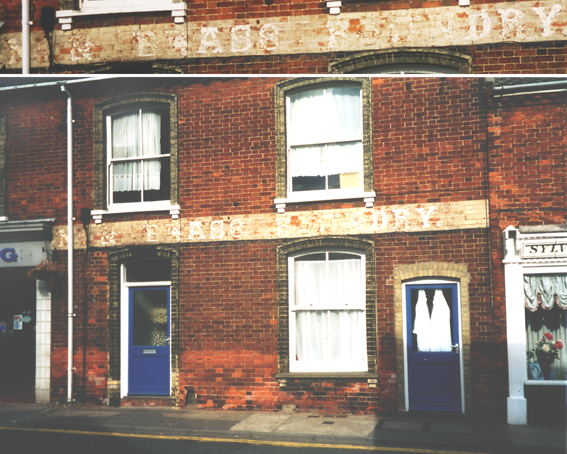
Let's start in Hungate, a fair distance out of the
town
centre. Here is
a fading sign:
'NEW[?] BRASS FOUNDRY' [see 2021 update below]
over a large-ish shop width (compared to its
neighbours
which are small and, in some cases, still struggling on in business).
The
lettering before this - more clearly seen in the upper close-up) which
runs behind the drainpipe to the left is
possibly
'NEW', but the premises are clearly an old workshop which has long been
converted
into
a house.
 2003 images
[UPDATE 7.2012. John
Field got in touch via our email to say:
'Many years ago I was told
that the family had a foundry in Beccles; my father used to tell
me many stories when I was a boy but, like lots of boys, I did not pay
as much attention as I should have done and many of the fables(?) have
been forgotten. Dad was born in Beccles and, I believe, went
to Beccles College before being sent as a boarder to Culford for
playing truant and taking his boat sailing on the river. [With
regard to the] 'Brass Foundry' I was told many years ago that the
foundry was owned by my great grandfather. He also used to tell
me about a factory owned by the family that made clay pipes,
saying this was one of the first factories in England. [He was a]
Church warden I believe. This factory was pulled down and a row of
cottages built in Peddars Lane This may have been owned by the Fields
or the Copemans(?), Dad's mother being a Copeman, that also being my
second name. I don't know how much of this is fact or legend. Hope
this may be of interest.' John Field]
[UPDATE 11.8.2021: 'I was in
Beccles last week and noticed the old signage on the wall of the
house/shop in Hungate. I thought I would research this but came up with
not a lot except for your web site. I see that you read it as NEW[?]
BRASS FOUNDRY. I read it as N & BRASS FOUNDRY, the N being the last
letter of another word and what you saw as the W in NEW being an
ampersand (&). IRON was the first thing that sprang to mind. A bit
more web searching lead me to (on the The
Foxearth and District Local History Society website) which seems to
indicate that my thought was correct and it was IRON & BRASS
FOUNDRY many years ago. Kind Regards, Andrew Phillips. Many thanks to Andrew for the clarification.]
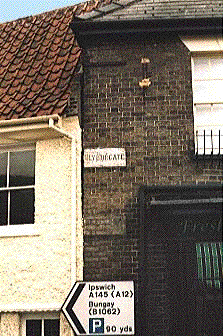
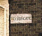
Nearer the centre is the painted 'BLYBURGATE' street
sign, one of
several in the town - the 'Northgate' one out towards the Smith and
Easthaugh sign (shown below) is virtually unreadable.
 -
-
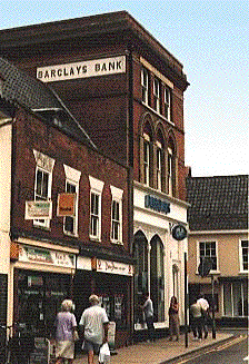
The high relief lettering cut in a cement panel and
in-filled with
black
'BARCLAYS BANK' overlooks the market. It makes an interesting
comparison
with the 'Bank' sign near to Cornhill
in Ipswich and another in Felixstowe.
 -
-
A few yards away from Barclays Bank to the left of the
above picture is
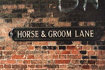
the narrow entrance to 'HORSE & GROOM LANE'. This fine decorated
piece
of street furniture has a rich relief colour with the lettering picked
out
in white. It stands up well against the spray-can graffiti above it.
 2006 images
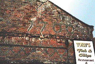
Returning to the top of Blyburgate, we find one of the
largest set of
date
numerals on a building seen anywhere: '1700'. This patchwork quilt of
an
end wall is at the side of Toby's Fish & Chip shop, close to the
passage
leading to the public library. Quite what came over the bricklayer who
had
already laid the dark brick lattice design in the lower courses of the
wall,
but we're glad it did. Those sensuous tails on the figures one and
seven
are the icing on the cake. This is in the running as the oldest example
of lettering included on these sites (others might be the stabling
lettering at East Bergholt & Stradbroke,
the 1650 sundial on the Moot Hall in Aldeburgh
or even the 'Smith & Easthaugh' sign at the bottom of this page -
although it has an archaic 's', it does read a bit too industrial
revolution, however).
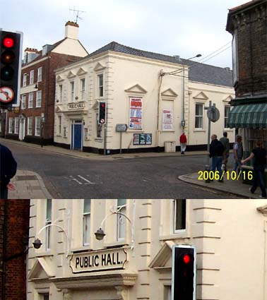
Smallgate runs away from the market square and on it, at the
crossroads, stands the cream painted stucco building labelled in very
large black capitals in a cartouche: 'PUBLIC HALL.' (with its
delightful, but wholly unnecessary full stop). This attractive building
is clearly used for regular bingo sessions and other entertainents, but
is marred by the usual clutter of modern signs and street furniture.

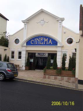
In Saltgate, not far from the market square, we find
another fine
building, well cared for, and boasting a wonderful coloured, curving
sign - now, sadly misleading and redundant: 'Cinema' in gold mosaic
lettering on a two-tone blue ceramic background. The town lost its
cinema at least ten years ago, we understand, and this finely detailed
building with its crest, square columns, pediments and roundels was
later a shop and now (2006) one of the continental cafés so
ubiquitous in our towns.

41 Northgate
Following this street out of town towards the river,
we move into
Northgate and further down the hill past fine Georgian houses (and
several plaques to comemmorate the great and the good who once lived
there), is one of the best lettering examples to be found on this
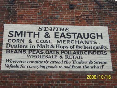
website: 'STAITHE,
SMITH & EASTAUGH, CORN & COAL MERCHANTS, Dealers in Malt &
Hops of the best quality. BEANS, PEAS, OATS, POLLARD, CINDERS,
WHOLESALE & RETAIL, Wherries constantly attend the Traders &
Steam Vessels for conveying goods to and from the Wharf.' This is a
grand, historic piece of trader's sign writing. Glimpsed as we drove
through the town down this winding narrow road in 2001, we were able to
stop for the 'Brass Foundry' above, but not for this one, so it's been
added in 2006. (It was also mentioned to Borin by Robert Malster - see Reading
List - when the former gave a talk to the Suffolk Local History
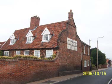
Council in 2004.) Now somebody – presumably the owner of the wonderful
redbrick house which stands at right angles to the road and on whose
end wall the sign is painted – obviously cares for this lettering and
it looks to be regularly retouched judging by its almost mint
condition. We owe the preservers of this sign a debt of gratitude. The
house is Grade II Listed: '17th century, altered. Red brick with band
and Dutch gable. 2 storey and attic. 3 dormers. Pantiles. 5 windows,
casements in flush frames. 6-panel entrance door.'
[UPDATE
17.1.2025: Jan Eastaugh from Ottawa, Canada got in touch in October
2024. Her grandfather emigrated to Canada from Metfield in Suffolk –
not far from this sign. Her latest update: 'Re the pronunciation of
Eastaugh, over here in the Colonies, it's 'EE - staw'. My cousin (born
and raised in Metfield) pronounces it EE-stuh but sometimes it does
sound like Easter. There are relatively few Eastaughs in North America.
Most in Canada are descended from my grandfather and his brother, who
came over from Metfield in 1906. Many more went to Australia and New
Zealand – either criminals or liked the warmer weather.' They could well have been 'free settlers'
who were encouraged to sail to Tasmania from Britain to start
businesses and make a new life in Australia. Many thanks to Jan for
finding us and for the information.]
This research
web-page indicates that ownership of the building can be dated back
to 1600. Smith & Eastaugh do not appear until 1896 and remain at
this location until 1938.


The dormer windows of this property suggest that
this has always
been a dwelling place - presumably that of either Mr Smith or Mr
Eastaugh - rather than a converted storage barn or maltings. The
whitish painted rectangle runs over bricked in windows of a dutch gable
end and is bisected horizontally by a line caused by the lower
brickwork being recessed slightly from that above. A delightful mixture
of fonts and styles is on display here: Italic, serifed caps at the top
with the decorative 'A', san-serif caps for the name and trades are
followed by a full stop. Then follows a line of serif roman lettering
with 'Malt' and 'Hops' bearing capital letters; back to sans-serif caps
for the list of further products this prodigious business dealt in;
'Wholesale & Retail' balance on a fine ampersand in serif capitals,
then the final triumphant announcement with its direct link to the
nearby wharf and the attendant wherries which used to lighter bigger
trading vessels. The archaic 's' which resembles an 'f' in 'Vefsels' at
lower left may suggest that this sign is older than it actually is. If
we assume that the industrial revolution started around 1770, it's
possible that steam vessels were visiting Beccles from around the
mid-1800s or later, perhaps. The signwriter was pleased to provide us
with the double-s of old and new style characters. We have gone into
some detail on this sign merely because of its great historical
importance in Beccles, in Suffolk and in England as a whole. We would
be pleased to hear of a rival elsewhere.
[Message from Ed Broom of this parish (15.11.06):
'Love that STAITHE, SMITH & EASTAUGH entry, and so well
maintained. Hats off. That mix of fonts and styles rather reminded me
of an old ad for my distant relations (true), the Freston Bros
of olde Ipswiche towne.' His website is on our Links
page.]
Home
Return to Historic Lettering from outside
Ipswich
Please email any comments and contributions by clicking here.
Search Ipswich
Historic Lettering
©2004 Copyright
throughout the Ipswich
Historic Lettering
website: Borin Van Loon
No reproduction of text or images without express
written permission

 2003 images
 -
-
 -
-
 2006 images